Is Your Navigation Overload Killing Your Website’s Performance? (2025/2026 Update)
The Silent Saboteur: Why Your Overloaded Navigation is Hurting Your Website
In the fast-paced digital landscape of 2025 and 2026, user expectations for website navigation are higher than ever. A clean, intuitive, and efficient user experience isn’t just a ‘nice-to-have’ – it’s a fundamental requirement for success. Yet, many websites still fall victim to a common, yet critical, design flaw: an overloaded top navigation menu.
Imagine walking into a store where every single product is displayed on the front counter. Overwhelming, right? That’s precisely the experience an overloaded navigation creates for your website visitors. Instead of guiding them, it confuses them, leading to frustration and ultimately, abandonment. This isn’t just about aesthetics; it has tangible, negative impacts on your site’s performance, user engagement, and conversion rates.
This post will delve into why an excessive number of navigation items is detrimental, how to identify if your site has this problem, and provide actionable, up-to-date strategies to streamline your menu for optimal user experience and business results.
What’s the Problem with an Overloaded Navigation?
At its core, an overloaded navigation menu creates cognitive overload. When presented with too many choices, users experience decision fatigue. They struggle to process the information, prioritize options, and ultimately, find what they’re looking for. This leads to:
Increased Bounce Rates: Users leave quickly when they can’t orient themselves.
Reduced Time on Site: Frustrated visitors spend less time exploring your content.
Poor Goal Completion: Key actions, like making a purchase or filling out a form, become harder to locate.
Accessibility Issues: Screen readers and keyboard navigation become cumbersome with too many elements.
Why a Cluttered Menu Harms Your Website’s Performance and SEO
The negative effects of an overloaded navigation extend beyond just user frustration:
1. User Experience (UX) Suffers
A cluttered menu directly contradicts modern UX principles that prioritize simplicity and clarity. Users expect to find information quickly and effortlessly. A confusing navigation path erodes trust and makes your site feel outdated, regardless of its visual design.
2. Conversion Rates Plummet
If your primary calls to action or product categories are buried among dozens of other links, users are less likely to find them. This directly impacts your bottom line, as potential customers struggle to complete their journey from browsing to conversion.
3. Mobile Usability Becomes a Nightmare
With mobile traffic often exceeding desktop, a responsive and mobile-first navigation strategy is non-negotiable in 2025/2026. An overloaded desktop menu translates into an unwieldy, often unusable, mobile menu, forcing users to scroll endlessly or tap through multiple layers to find basic information. This is a critical performance bottleneck.
4. SEO Can Take a Hit
While not a direct ranking factor, an excellent user experience indirectly benefits SEO. High bounce rates and low time on site signal to search engines that users aren’t finding value, potentially impacting rankings. Furthermore, a poorly structured navigation can dilute link equity and make it harder for search engine crawlers to understand your site’s hierarchy and discover important pages efficiently.
How to Check if Your Navigation is Overloaded
Identifying the problem is the first step towards a solution. Here’s how to diagnose an overloaded navigation:
Count Top-Level Items: A general rule of thumb suggests limiting top-level navigation items to 5-7 maximum. If you have significantly more, it’s a strong indicator of clutter.
Test on Mobile Devices: Use various screen sizes and orientations. Is the menu easy to open, close, and navigate? Are sub-menus manageable?
Check for Buried Important Pages: Are your most critical pages (e.g., ‘Contact Us’, ‘Pricing’, ‘Key Services’) hidden deep within sub-menus or requiring multiple clicks to reach?
Review User Behavior Data: Utilize analytics tools (e.g., Google Analytics 4, Hotjar) to analyze navigation paths, click-through rates on menu items, and exit pages. Look for patterns of users struggling to find content.
Conduct User Testing: Even informal testing with a few individuals can reveal significant usability issues. Ask them to complete specific tasks using your navigation.
Actionable Steps to Fix an Overloaded Navigation (2025/2026 Best Practices)
Optimizing your navigation is a strategic process that requires careful planning and execution. Here are modern approaches to streamline your menu:
1. Prioritize and Consolidate
Identify Core User Journeys: What are the primary reasons users visit your site? Structure your navigation around these key tasks and information needs.
Group Related Items: Use logical categories to group similar pages under a single, descriptive top-level item.
Eliminate Redundancy: Remove duplicate links or pages that can be consolidated.
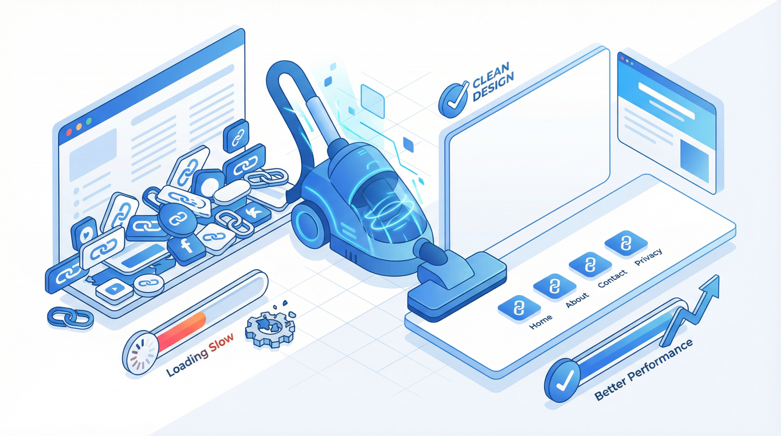
Utilize Footer Navigation: Less critical but still important links (e.g., ‘Privacy Policy’, ‘Terms of Service’, ‘Careers’) can be moved to the footer, reducing clutter in the primary navigation.
2. Implement Smart Navigation Patterns
“More” or “Hamburger” Menus: For sites with a slightly larger number of items, a “More” dropdown (often represented by three dots or a plus sign) can house secondary links. For mobile, the ubiquitous hamburger menu (☰) is standard.
Mega Menus: For complex sites with many hierarchical categories (e.g., e-commerce), a well-designed mega menu can present a large number of options in an organized, visually appealing way. Ensure it’s responsive and doesn’t overwhelm on smaller screens.
Search Functionality: A prominent search bar is an essential navigation tool, especially for users who know exactly what they’re looking for.
3. Leverage Modern Development Techniques (WordPress Examples)
For WordPress users, here are code-based solutions to implement some of these best practices:
Automatically Limit Menu Items and Create “More” Dropdown
This PHP snippet (to be added to your theme’s functions.php or a custom plugin) dynamically limits top-level items and creates a “More” option for overflow:
// Automatically limit menu items and create "More" dropdown
function optimize_navigation_menu($items, $args) {
    if ($args->theme_location === 'primary') {
        $item_count = 0;
        $main_items = array();
        $overflow_items = array();

        foreach ($items as $item) {
            if ($item->menu_item_parent == 0) {
                $item_count++;
                if ($item_count <= 6) { // Limit to 6 top-level items before "More"
                    $main_items[] = $item;
                } else {
                    $overflow_items[] = $item;
                }
            } else {
                // Keep child items with their parents
                if (in_array($item->menu_item_parent, array_column($main_items, 'ID'))) {
                    $main_items[] = $item;
                } else {
                    $overflow_items[] = $item;
                }
            }
        }

        // Add "More" menu if there are overflow items
        if (!empty($overflow_items)) {
            $more_item = new stdClass();
            $more_item->ID = 9999;
            $more_item->title = 'More';
            $more_item->url = '#';
            $more_item->menu_item_parent = 0;
            $more_item->classes = array('menu-item-has-children');
            $main_items[] = $more_item;

            // Add overflow items as children of "More"
            foreach ($overflow_items as $overflow_item) {
                $overflow_item->menu_item_parent = 9999;
                $main_items[] = $overflow_item;
            }
        }
        return $main_items;
    }
    return $items;
}
add_filter('wp_nav_menu_objects', 'optimize_navigation_menu', 10, 2);
Implement Mega Menu for Complex Navigation
This PHP snippet helps identify menu items that should trigger a mega menu (requires corresponding CSS/JS for styling and functionality):
// Create mega menu structure
function create_mega_menu($items, $args) {
    if ($args->theme_location === 'primary') {
        foreach ($items as $item) {
            // Add mega menu class to items with many children
            $children = array_filter($items, function($child) use ($item) {
                return $child->menu_item_parent == $item->ID;
            });
            if (count($children) > 4) { // Example: if more than 4 children, make it a mega menu
                $item->classes[] = 'mega-menu-item';
            }
        }
    }
    return $items;
}
add_filter('wp_nav_menu_objects', 'create_mega_menu', 10, 2);
Ensure your mobile navigation is accessible and functional. This involves a toggle button, responsive CSS, and JavaScript to handle the menu’s open/close state.
HTML (add to your header, typically before or after your main navigation):
A/B Testing: Experiment with different menu structures, labels, and layouts to see what performs best with your audience.
Heatmaps and Session Recordings: Tools like Hotjar or Microsoft Clarity can provide visual insights into how users interact with your navigation.
Regular Audits: As your website evolves, periodically review your navigation to ensure it remains relevant and efficient.
Conclusion
An optimized top navigation is not merely a design detail; it’s a critical component of your website’s overall performance, user satisfaction, and conversion success. By understanding the pitfalls of an overloaded menu and implementing these modern best practices, you can transform a source of frustration into a powerful tool that guides users seamlessly through your site. Invest in a clean, intuitive navigation, and watch your website thrive in the competitive digital landscape of 2025/2026.