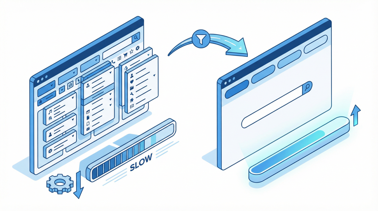
A long page is not read, it is scanned. Someone arrives from a search result with one question, looks for the part that answers it, and leaves if they cannot see it within a few seconds. Structure is what makes that possible — and the same structure is what lets a search engine understand which part of your page answers which question.
Headings are structure, not styling

Advertisement. We earn a commission if you sign up through this link, at no extra cost to you.
Headings define the outline of a document. Screen reader users navigate by jumping between them, which means a page whose headings are chosen for their font size is a page that cannot be navigated at all.
One H1, matching what the page is about. Google has said multiple H1s will not break anything, and the HTML specification permits them. That is not a reason to use several. One H1 is clearer for everyone, and it is what your theme already outputs from the post title.
Do not skip levels. H2 then H4 leaves a gap in the outline. Every H3 belongs under an H2.
The most common failure is subtler: a page whose real sections all sit at H3 with a single decorative H2 above them, usually because the H2 style looked too big. The visible result is fine and the document structure is wrong — every section is nested under a heading that is not its parent.
Write headings that say something. “How to check whether your staging site is indexed” is a heading someone can act on. “Overview” is not. This matters beyond readability: featured snippets are frequently assembled from a heading and the text immediately under it, so a heading phrased as the question someone asked is the one that gets picked.
And do not repeat the title as the first heading in the body. The theme already renders the title as the H1. Repeating it means the visitor reads the same sentence twice before reaching any content.
Answer first
The convention that works online is the inverted pyramid: conclusion first, then supporting detail, then background.
The instinct is the opposite — establish context, build the argument, arrive at the answer. That works when someone has committed to reading. Someone who arrived from a search result has committed to nothing.
Under each heading, the first sentence should answer the question the heading raises. Everything after it is for the readers who want more, and they will keep reading precisely because the first sentence proved the section was relevant.
This has become more consequential as answers get assembled by machines. Generated summaries and featured snippets both pull short passages that directly answer a query. A page that buries its answer in paragraph six of a section is a page that does not get quoted.
Anchor navigation on long pages
Past roughly 1,500 words, a table of contents earns its place. It shows the shape of the page at a glance, lets someone jump to the part they need, and gives you a set of internal anchors.
It also affects how your result looks in search: Google generates “jump to” links to sections of a page, and clear headings with stable anchor IDs are what make a page eligible.
Practical requirements:
- Stable, readable IDs. #fixing-redirect-chains, not #h-3. Auto-generated numeric IDs change when you add a section, breaking every link anyone shared.
- Scroll offset for sticky headers. A fixed header will cover the heading you just jumped to unless you set scroll-margin-top.
- Real links. Anchor navigation built from JavaScript click handlers cannot be opened in a new tab, copied, or used with a keyboard.
In WordPress the block editor generates heading anchors, and several plugins build the table of contents automatically from them.
Hidden content: what is actually true
This subject carries a lot of outdated advice, so here is the current position.
Content inside accordions and tabs is indexed normally. Since the move to mobile-first indexing, Google has confirmed repeatedly that content hidden behind a tab or an expandable section is crawled, indexed and weighted the same as visible content. The old advice that hidden content is discounted has been wrong for years — it dates to a desktop-first era and people are still repeating it.
So progressive disclosure is a legitimate design pattern. FAQ accordions, expandable specification tables, “read more” on long descriptions — all fine, all indexed.
What is not fine is hiding content from people while showing it to crawlers. That is cloaking, and it is a spam policy violation with real consequences. The patterns that trigger it:
/* problems */
.keywords { display: none; }          /* keyword text nobody sees */
.stuffing { font-size: 0; }
.invisible { color: #fff; }           /* white on white */
.offscreen { text-indent: -9999px; }
/* legitimate */
.mobile-menu { display: none; } /* shown when opened */
.accordion-panel { display: none; } /* shown when expanded */
.screen-reader-text { /* visually hidden, read aloud */
position: absolute !important;
clip-path: inset(50%);
width: 1px; height: 1px; overflow: hidden;
}The distinction is intent and equivalence. If a visitor can reach the content by clicking something, it is progressive disclosure. If it exists only for crawlers, it is cloaking. Screen-reader-only text is a third category and entirely proper — it serves a real audience, just not a visual one.
One genuine caveat: accordion content is indexed, but it is not seen unless someone opens it. If a section matters to your conversion, do not hide it. That is a UX judgement, not an SEO one.
The paragraph-level stuff
Less glamorous and it does most of the work.
Short paragraphs. Two to four sentences. A wall of text is skipped regardless of quality, and on a phone a six-sentence paragraph fills the screen.
Vary sentence length. All-short reads like a list. All-long is exhausting. The mix is what makes prose readable.
Lists for lists. Sequential steps are numbered, non-sequential items are bulleted, and prose stays prose. Everything as bullets is its own kind of unreadable.
Bold sparingly. A few emphasized phrases guide the eye. A page where every third phrase is bold has no emphasis at all.
Real line length and spacing. Around 60 to 80 characters per line, generous line height. Two CSS rules, and they change how a page feels more than most redesigns.
The short version
One H1, no skipped levels, headings that say something rather than label something. Answer the question first and explain afterward, because that is how both scanners and snippet algorithms read. Add a table of contents past 1,500 words with stable anchor IDs. Use accordions freely — hidden content is indexed normally and has been for years — but never hide text that exists only for crawlers. And keep paragraphs short, which is the cheapest improvement on this page.
Working through this list on your own site and would rather not? That is what an Expert Web Audit is for.

Advertisement. We earn a commission if you sign up through this link, at no extra cost to you.