
Mastering Cumulative Layout Shift (CLS): A Key to Superior User Experience and SEO
In the ever-evolving landscape of web performance, user experience reigns supreme. Among the critical metrics that dictate a website’s perceived speed and stability, Cumulative Layout Shift (CLS) stands out as a crucial indicator. As a Core Web Vital, CLS directly impacts how users interact with your site and, consequently, its search engine rankings. But what exactly is CLS, and how can you ensure your website delivers a seamless, jank-free experience?
What is Cumulative Layout Shift (CLS)?

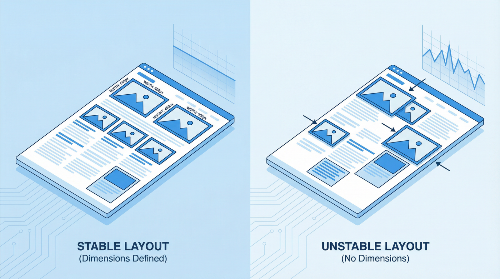
Cumulative Layout Shift (CLS) measures the unexpected shifting of visual page content. Imagine you’re about to click a button, but just as your finger descends, an ad or an image suddenly loads above it, pushing the button out of reach. This frustrating experience is a layout shift. CLS quantifies the total sum of all individual layout shift scores for every unexpected layout shift that occurs during the entire lifespan of a page.
A low CLS score indicates that your page is stable and predictable, providing a better user experience. Conversely, a high CLS score signals a chaotic and potentially frustrating interaction, leading to higher bounce rates and reduced engagement.
Why CLS Matters for Your Website
The importance of CLS cannot be overstated, especially in 2025/2026. It remains a critical component of Google’s Core Web Vitals, a set of metrics that measure real-world user experience. A poor CLS score can negatively impact your website’s:
- User Experience: Unexpected shifts are annoying and can lead to misclicks, lost user trust, and a general sense of frustration.
- Conversion Rates: If users struggle to interact with your site due to shifting elements, they are less likely to complete desired actions, such as making a purchase or filling out a form.
- SEO Performance: As a Core Web Vital, CLS directly influences your search engine rankings. Google prioritizes websites that offer a superior user experience, and a stable layout is a significant part of that.
The current threshold for a ‘good’ CLS score is less than 0.1. Scores between 0.1 and 0.25 need improvement, and anything above 0.25 is considered poor.
Common Causes of CLS
Layout shifts often occur due to elements loading asynchronously or dynamically, without reserving space in the document flow. Key culprits include:
- Images and Videos without Dimensions: If the browser doesn’t know the dimensions of an image or video before it loads, it can’t reserve the correct amount of space, causing content to shift once the media appears.
- Ads, Embeds, and Iframes: Third-party content often loads dynamically and can push existing content around if their containers don’t have explicit dimensions or if they inject content after the initial layout.
- Dynamically Injected Content: Content injected into the DOM after initial page load, such as cookie banners, pop-ups, or personalized content, can cause significant shifts if not handled carefully.
- Web Fonts Causing FOIT/FOUT: When web fonts load, they can cause a Flash of Invisible Text (FOIT) or Flash of Unstyled Text (FOUT), leading to layout shifts as the text reflows with the custom font.
How to Check Your CLS Score
Several tools can help you diagnose and monitor your website’s CLS score:
- Google PageSpeed Insights: Provides both lab data (simulated load) and field data (real user data) for CLS, along with actionable recommendations.
- Lighthouse: Integrated into Chrome DevTools, Lighthouse offers a comprehensive audit of your web page, including CLS scores and suggestions for improvement.
- Chrome DevTools: The Performance panel in Chrome DevTools allows you to record page loads and visually identify layout shifts. You can also enable the Layout Shift Regions’ visualizer to highlight areas experiencing shifts.
- Google Search Console: The Core Web Vitals report in Search Console provides an overview of your site’s performance across all Core Web Vitals, including CLS, based on real user data.
Actionable Steps to Fix CLS
Addressing CLS requires a proactive approach to how elements load and render on your page. Here are key strategies to minimize layout shifts:
- Always Include Size Attributes on Images and Video Elements:
Specify
widthandheightattributes on your image and video tags. This allows the browser to reserve the necessary space before the media loads, preventing content from shifting.<img src="hero.jpg" width="1200" height="600" alt="Hero Image">For responsive images, use CSS aspect ratio boxes or the
aspect-ratioCSS property (supported in modern browsers) to maintain the correct proportions. - Reserve Space for Ads, Embeds, and Iframes:
For third-party content like ads, embeds, and iframes, ensure you reserve sufficient space in the layout. If the exact dimensions are unknown, use a placeholder or style the container with a minimum height to prevent significant shifts.
Consider using the
min-heightCSS property or a skeleton loading UI to occupy the space before the content fully loads. - Avoid Inserting Content Above Existing Content:
Unless in response to a user interaction, avoid dynamically injecting content above existing content. This is a common cause of unexpected layout shifts. If content must be added, ensure it’s done in a way that doesn’t push down other elements, perhaps by using overlays or modals that don’t affect the document flow.
For elements like cookie banners or promotional pop-ups, consider placing them at the bottom of the viewport or using fixed positioning to prevent layout shifts.
- Preload Web Fonts and Manage Font Display:
Web fonts can cause layout shifts when they load and replace fallback fonts. To mitigate this:
- Preload critical web fonts: Use
<link rel="preload" as="font" type="font/woff2" crossorigin href="/fonts/myfont.woff2">to fetch fonts earlier. - Use
font-display: optionalorswap: Thefont-displayCSS property controls how fonts are displayed while loading.optionalgives the font a short block period and a short swap period, whileswapgives the font a zero second block period and an infinite swap period. Choose the one that best balances performance and visual consistency for your site. - Pre-render with fallback fonts: Ensure your fallback fonts are as close in size as possible to your web fonts to minimize reflow when the web font loads.
- Preload critical web fonts: Use
- Animate with CSS Transforms, Not Properties that Trigger Layout:
When animating elements, prefer CSS properties that don’t trigger layout changes, such as
transform(e.g.,transform: scale(),transform: translate()) andopacity. Avoid animating properties likewidth,height,margin, orpadding, as these can cause significant layout shifts.
Conclusion
Optimizing for Cumulative Layout Shift is not just about satisfying search engine algorithms; it’s about delivering a polished, professional, and enjoyable experience for your users. By understanding the common causes of CLS and implementing the actionable strategies outlined above, you can significantly improve your website’s stability, boost user engagement, and enhance your overall SEO performance in 2025 and beyond. A stable layout is a cornerstone of a high-performing website, ensuring that your visitors can interact with your content without frustrating interruptions.


 in 2025/2026")

: The New Core Web Vital for a Responsive Web")